Color Scheme Report
Color Scheme Report
Company Name: Creative Spark, a company that specializes in branding, digital and advertising.
URL: http://www.CreativeSpark.co.uk
I Liked the Website: I visited many website on the internet and choose creativespark.co.uk as I believe this website has incorporated an attractive color scheme. The website has a 43.20% bounce rate on https://www.Alexa.com that implies that around 60% of its visitors browse at least one more page on the website when they arrive at the website. We could say that the website is able to create first impression on around 60% of its visitors. The bounce rate should have been better but I think as the website has a specific pool of visitors, anyone else who arrives from search engines and are looking for something else just bounce back from the first page.
Colors Scheme: CreativeSparks’s has incorporated a 3 color scheme into the overall design of their website. They have relied on black, yellow and white colors. In my opinion the color scheme of the website is in line with the name of the company i.e.
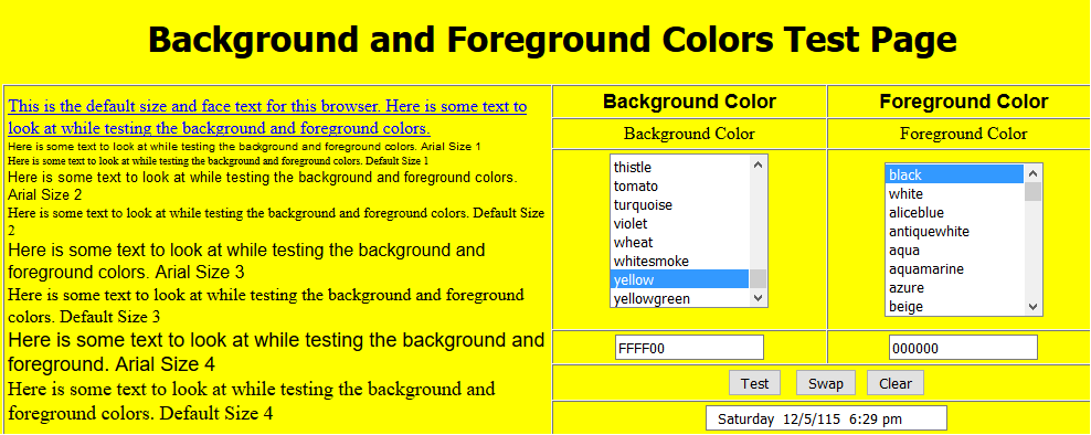 Fig.1 Yellow vs Black
when you visit the website it gives a feeling of a light bulb that is related to creativity. The name of the company uses the keyword “creative” in their name.
White color has been used on the background while yellow and black dominate the foreground in the text and design. I used http://allenk.home.infionline.net/testcolors.html to check for the appropriateness of different colors used at the background and foreground. The results were similar to what I observed with my naked eye. As it can be seen in Fig.1 that yellow color when used to be in background to black color text in the foreground, has good results if the eyes of the viewer. On the other hand it can be observed in Fig.2 that white does not do well in foreground with yellow background. These are the same effects I observed when I visited the website.
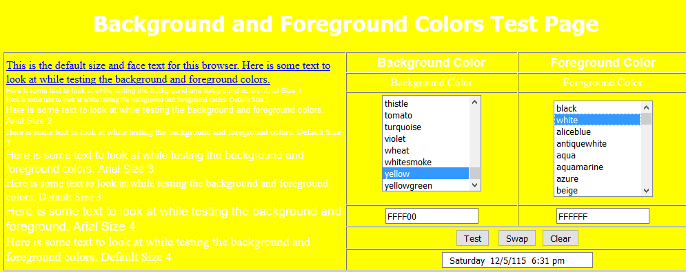 Fig.2 Yellow vs White
Squint Test: with a squint test I observed yellow to be “popping out” the most. I believe this is justified, as this is the main color that signifies the creative nature of the work the website is offering. Black is also observable during the squint test but not as dominant as yellow is.
Evaluation for color-blind visitors: I uploaded a screenshot from the website to vischeck.com to make an assessment on how it would look to a color-blind viewer. There is not a significant difference when the website is viewed from a color-blind perspective. As it can be seen in Fig.3
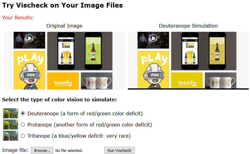 Fig.3 Vischeck Color-Blind Test
The two images, before and after the test have minor differences in color schemes where green or pinkish red has been used. These are not the significant parts of the website so does not make a lot of difference. This does not affect the legibility and squint test a lot in my opinion when compared to the original color scheme.
Suggestion: The fact that the website is developed by a digital branding company does not leave a lot of room to suggestions when it comes to the design part of the website. The only suggestion that I would make is that there could have been a bit more text used to engage visitors more efficiently.
Related Posts
 CS 112 Homework 1
 The Cask of Amontillado” by Edgar Allen Poe Overview
 What steps would you advise Starbucks’ management to take to make the acquisition successful?
 Abused Drug or Disease
 Some experts are predicting that Ethernet will move into the WAN. What do you think?
- Title IX and discrimination against international students